Rethinking Bank of America's Identity system
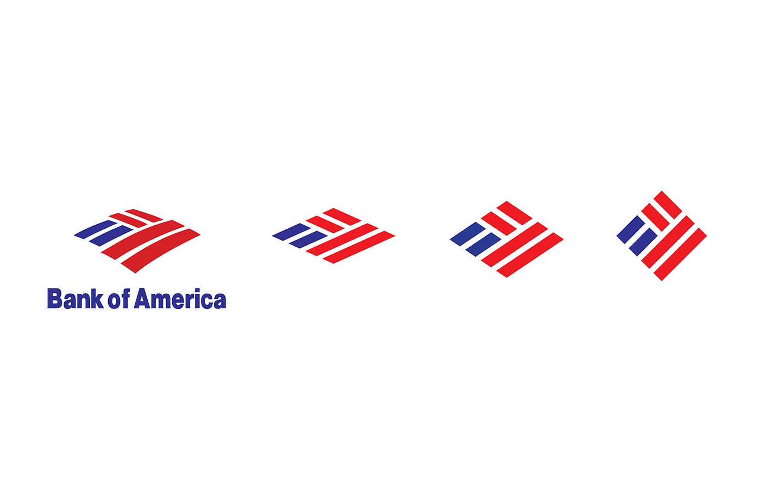
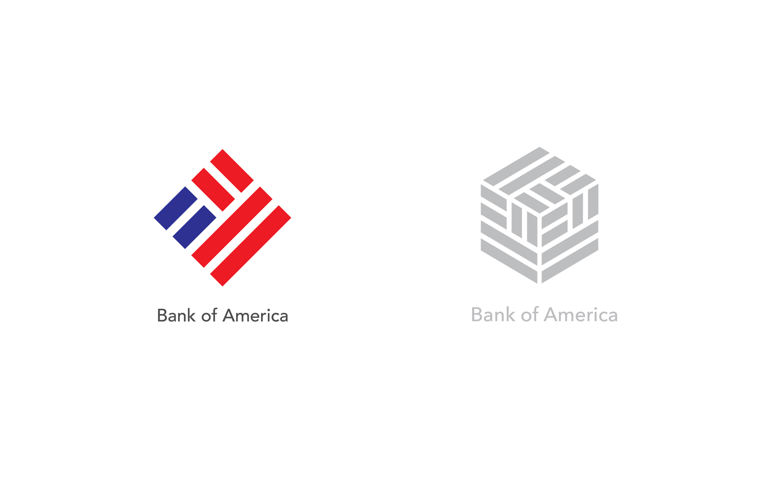
Rebranding Bank of America was an Academic Project which is done at Art Center College of Design. According to my research, I have found three important brand attributes are missing, which were Organized, Friendly and Reliable. Based on that, I started to redesign the present logo.This is the progress that we followed to redesign the logo. On the left side is the current logo transforming into a newly refined version. It is kept the flag idea and made it more organized. There is also designed a three-dimensional version of the logo which can be used for preferred customer services.

And then I came up with a new idea for a campaign, which called Forgotten Values. The purpose was to show people how Bank of America is friendly, creative and reliable. I wanted to make a connection between now and their childhood and exploring some forgotten values. Things that we reminisce. Here I would like to ask you:
Do you remember your forgotten values?

Bank of America reminds you … you used to play marbles. For you, they were uncountable.
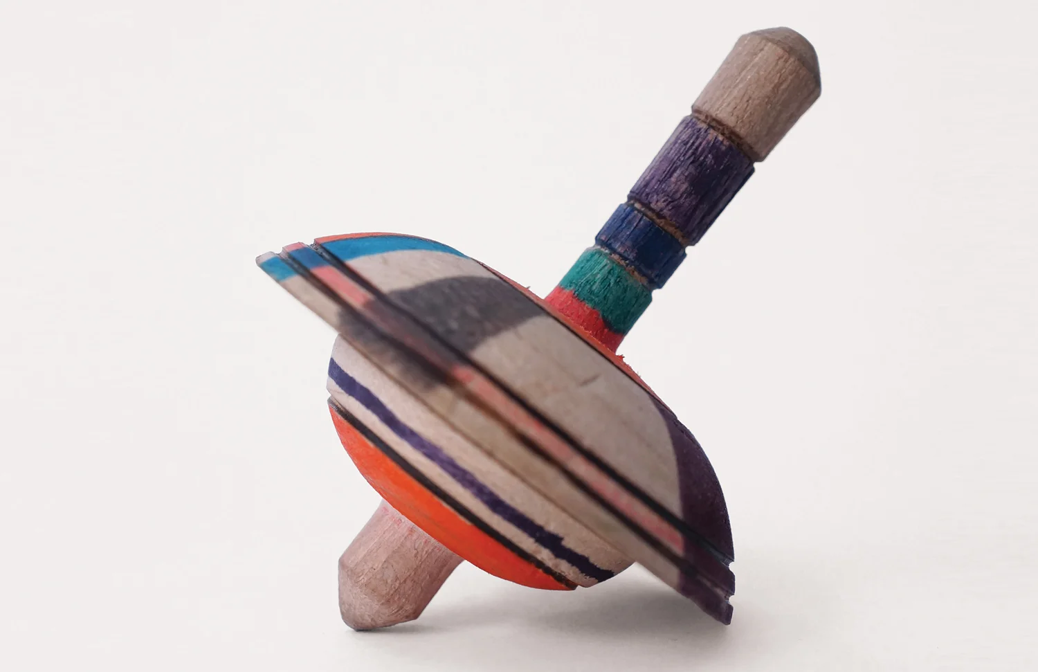
When you were playing with your top … you had your own technique. Your top was peculiar … do you remember that?

You were a master of hand shadows … you were creative …

You used to look at clouds and see animals and other creatures. Do you remember a Dolphin?
Stationary System
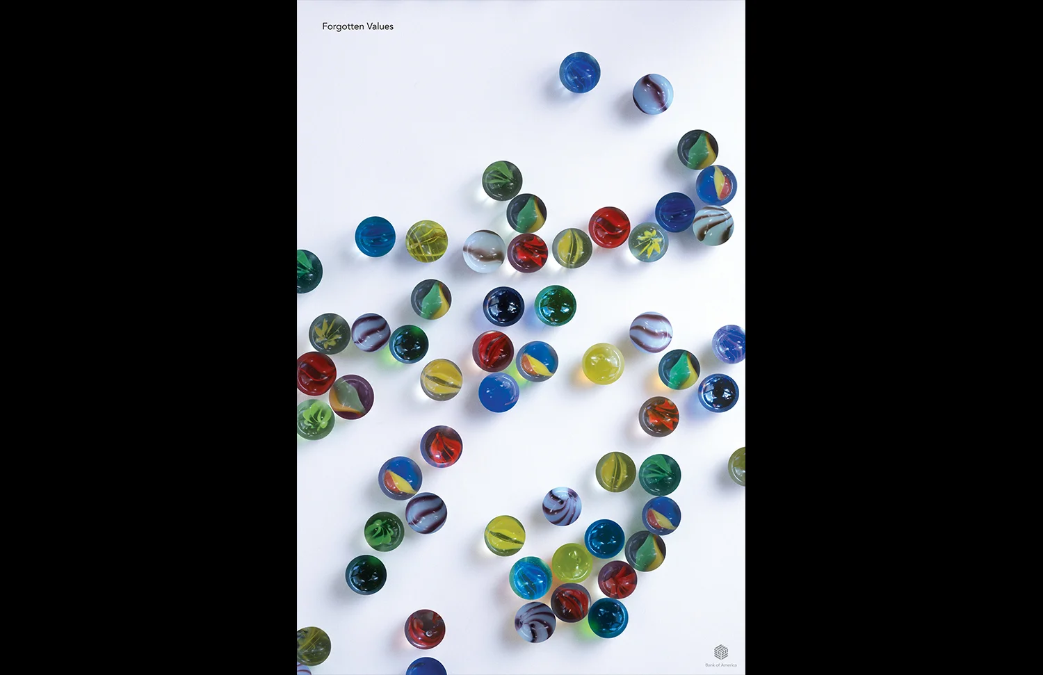
The Poster of Forgotten Values, got awarded by Graphis Magazine in 2018.


The gift package is designed based on the logo.